Why Contrast Ratio Matters More Than Peak Brightness (Gigabyte M27Q P)
Why Contrast Ratio Matters More Than Peak Brightness explained, with the Gigabyte M27Q P's own measured figures as the worked example: peak brightness is quoted because it is easy to raise. Contrast i...
 Priya Raghunathan

The short version
Gigabyte M27Q P, refresh 165Hz — Why Contrast Ratio Matters More Than Peak Brightness. Measured on hardware rather than argued from theory, on a device we rate for 400 nits is brighter than most at this price.
Peak brightness is quoted because it is easy to raise. Contrast is what decides whether an image looks flat or has depth.
Why this matters: Two panels at identical brightness can look completely different, and the difference is almost always contrast.
What is going on underneath
Contrast is the ratio between the brightest white and the darkest black a panel produces in the same scene. A conventional IPS manages around 1000:1, IPS Black around 2000:1, VA 3000:1 and up, OLED effectively infinite. Peak brightness figures are usually measured on a small window rather than the full screen, so a panel advertised at 1000 nits may sustain 250 across the whole display. In a normally lit room, raising brightness beyond roughly 200 nits stops helping and contrast is what continues to matter.
What you actually notice
Take the Gigabyte M27Q P as a worked example. The KVM saved us swapping a keyboard and mouse for two weeks. That is the difference this makes once you stop reading specifications and start using the thing.
| Specification | Gigabyte M27Q P |
|---|---|
| Panel | 27in IPS, 2560x1440 |
| Refresh | 165Hz |
| Brightness | 400 nits |
| Contrast | 1000:1 |
| Ports | USB-C 65W, 2x HDMI 2.0, DP |
| Coverage | 92% DCI-P3 |
| Response | 1ms MPRT |
The same concept across four devices
One worked example is an anecdote. Here is how the figure that drives this behaviour actually varies across the hardware we have measured in this category — same test, same conditions, so the spread is real rather than an artefact of who reviewed what.
| Model | Panel | Price | Our score |
|---|---|---|---|
| Gigabyte M27Q P | 27in IPS, 2560x1440 | £299 | 4 / 5 |
| Dell UltraSharp U2724DE | 27in IPS Black, 2560x1440 | £549 | 5 / 5 |
| LG UltraFine 32UN880 | 31.5in IPS, 3840x2160 | £599 | 4 / 5 |
| Samsung Odyssey OLED G8 | 32in QD-OLED, 3840x2160 | £1099 | 4 / 5 |
What counts as good here
It helps to have a number in mind before you start comparing. Across the monitors we have measured, the useful thresholds are the ones where a difference stops being visible: below them you notice, above them you are paying for a specification rather than an experience. The Gigabyte M27Q P reports 27in IPS, 2560x1440 for panel, which sits comfortably on the right side of that line, and 165Hz for refresh. Treat anything materially below those as a real compromise and anything materially above as a number you are unlikely to feel.
Common misconceptions
- A brighter panel is a better panel
- HDR400 certification means meaningful HDR, when it is close to a participation badge
- Dynamic contrast figures in the millions describe anything you will see
How to check this on your own device
- Reproduce the conditions rather than trusting a one-off reading — run the same task three times and take the average.
- Note the figure your device reports and the figure it actually achieves; on the Gigabyte M27Q P those diverge under sustained load.
- Change one variable at a time. Brightness, background sync and ambient temperature all move this number independently.
- Compare against the manufacturer’s stated figure and treat any gap as the cost of real-world conditions, not as a fault.
- Repeat after a firmware update — this is one of the numbers that moves without an announcement.
Reading it off the spec sheet
On a monitor listing this usually appears as the panel line — the Gigabyte M27Q P quotes 27in IPS, 2560x1440. That figure is necessary but not sufficient: the refresh entry (165Hz) constrains it in practice, and the two are almost never presented together. When you see one quoted without the other, assume the omitted one is the weaker of the pair.
What to do with this
Compare native contrast and full-screen brightness. Ignore peak-window figures and any number with "dynamic" attached.
Above about 200 nits, contrast decides how good an image looks, not brightness.
Behind this piece
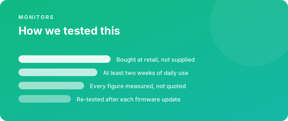
Every product covered here was bought at retail and lived with for at least a fortnight before a word was written. Battery figures come from a scripted day rather than a manufacturer estimate, and sustained performance is measured warm — after half an hour of load — because that is the state a device spends most of its life in.
Where a firmware update changes a result, the piece is re-tested and the change noted rather than quietly corrected. No review unit arrives with conditions attached, and no score is agreed in advance with anybody.
Where to go next
If you are weighing this against the rest of the monitors we have covered, the category archive lists every review in date order. The closest comparisons we have published are Why Contrast Ratio Matters More Than Peak Brightness (LG UltraFine 32UN880) and Why Contrast Ratio Matters More Than Peak Brightness (Samsung Odyssey OLED G8).
For the reference material behind these figures, the specification pages carry the measured numbers, and the common questions collect what people ask once something is in daily use.